Accessibility Best Practices
When it comes to accessibility, make sure you are in the know.
What is Web Accessibility?
According to W3C Web Accessibility Initiative, web accessibility "means that websites, tools, and technologies are designed and developed so that people with disabilities can use them. More specifically, people can (1) perceive, understand, navigate, and interact with the Web; and (2) contribute to the Web." Ensuring that your website content is accessible to all users on all devices is an important element to maintaining the best possible user experience for your site visitors.
Read on to learn more about best practices for keeping your content accessible.
Clear Approach on Venue Policy and Contact Information
Create a web accessibility statement that reflects your organization's philosophy regarding web accessibility and includes a method of contact if a patron has issues using the website, such as a phone number, and/or email address. Make sure the chosen method of contact is monitored. Manage expectations on response times and stick to it!
Visit w3.org for more information on how to develop an accessibility statement.
Ensure your organization is maintaining accessibility standards
Keep it Simple
Use easy-to-understand, shorter common words and phrases. Not only is this easier for ALL guests to locate the information they’re seeking but this serves as an SEO boost as well.
Use Consistent Language
Your content should be consistent across the entirety of your site. For example Seating Charts vs Maps.
Demand Accessible Assets
Your partners and event promoters need to be included in your efforts and be accountable for the assets they provide. This should be an industry wide push. (i.e. images and forms).
Provide Captions and Transcripts
When sharing videos or audio clips, provide captions or transcripts. Auto-captioning is offered by YouTube and affordable transcription services are available for as low as $.84/minute (as of April 2023).
Use Accessible PDFs
Standard PDF files can typically not be read by screen readers, we suggest testing your PDFs. Adobe Acrobat has a simple to follow process for updating your files.
Avoid Using Tables
Tables are challenging for screen readers, so avoid using them when possible. When necessary, use headers for rows and columns.
Use Existing Styles
Avoid overriding your approved design styles with added HTML/CSS. Custom added and third-party code cannot be supported and may go against our tested accessibility standard.
Use Appropriate Page Titles
Ensure your page titles accurately reflect the content included on the page.
Use Text, Not Pictures of Text
Screen readers cannot read text on images.
Use Color With Care
Avoid using color to convey meaning. There are tools you can use to evaluate color contrast to assist in making your assets as usable as possible for those with low vision and color blindness.
Avoid Directionals
Avoid using language which indicates location on your webpage such as “See below” or “View Info to the Left.” Directionals are only clear when the screen is at 100%. If a user has zoomed in or out, or if the user is on a tablet or mobile, the directionals may no longer make sense.
Use Clear Calls to Action
Use clear calls to action instead of “click here” for links. For example, instead of saying "click here to buy a season package" with click here as the call to action, say "Purchase a season package" as your call to action. "Click here" poses similar issues as using directionals mentioned previously, because a user visiting the site with a screen reader may not be able to determine where "here" is on the page.
Use Headings Properly
Heading tags establish the hierarchy of your pages -- this is true for those physically reading the page and for those using technical assistance. Headings should go in order from H1 to H4 respectively. Remember writing book reports in grade school? You never thought you'd need that skill again, but here we are! Structure your page content the same way you would an outline of a book report:
- I. H1 - Title: Accessibility Best Practices
- A. H2: Clear Approach on Venue Policy and Contact Information
- B. H2: Ensure your organization is maintaining standards
- 1. H3: Keep It Simple
- 2. H3: Use Consistent Language
Add Alt-Text
Use alt-text to provide access to the content of images for those who cannot see them. This also serves to improve your SEO efforts. Alt Text Recommendation: > 100 characters
Listing Images (Events, Spotlights, News, Visitor Guide)
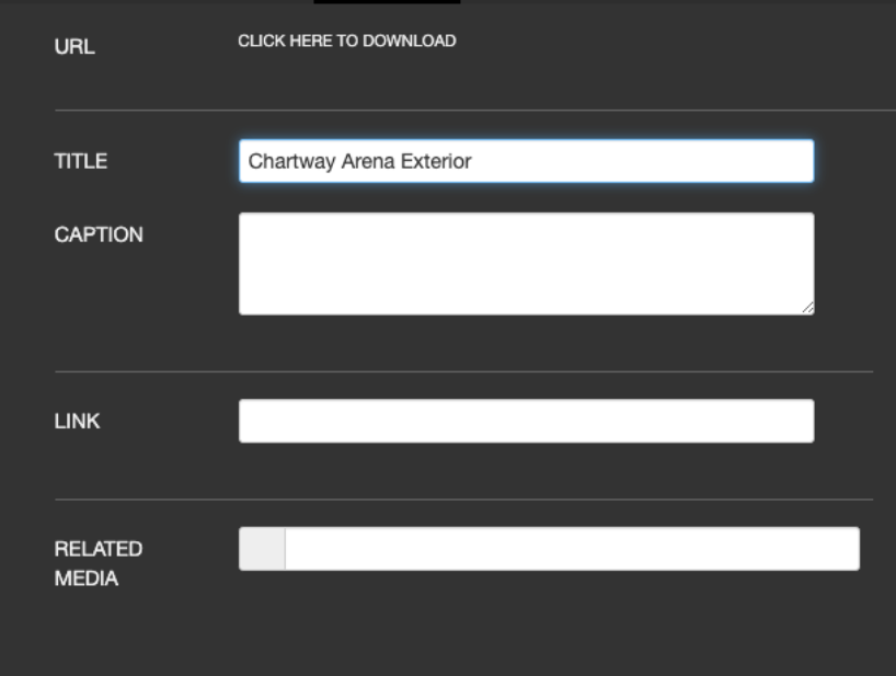
These will automatically be given an alt-text of “More info for...” or use the title as the alt-text.

Any Non-Event Slides within Homepage
The system will use the title of the media item, unless using the file name (i.e. .jpg). In which case, an alt-text of *NULL will be used.
*Null: indicates to assistive technology that the image can be safely ignored.

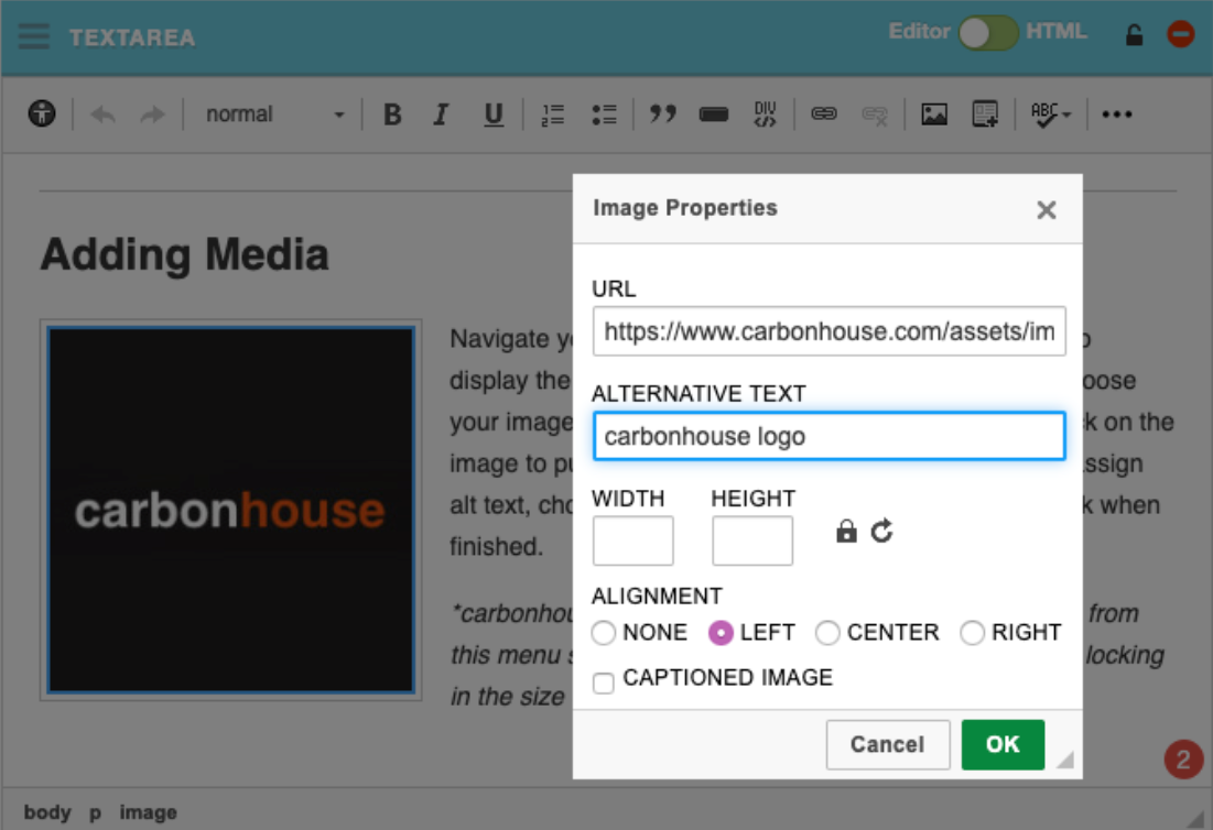
Images within Text
You must add alt-text under the image properties by double clicking on the image.
